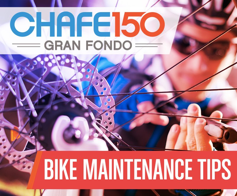
CHAFE150 Gran Fondo
I worked with Rotary International as the creative director and lead designer for the CHAFE150 Gran Fondo cycling event, one of the Top 10 Charitable Bike Rides in the country.
For 6 years, I collaborated with stakeholders and riders to brand and advertise the event in physical and digital spaces and help it grow, and the results speak for themselves:
As a direct result of my team’s creative direction and contributions, CHAFE150 ridership grew 30% year over year and raised over $260,000 to support students of the local school district on the Autism spectrum and fund after school reading programs.
Creative Direction • Branding + Identity • Graphic Design • Web Design + Development • Apparel Design


Apparel Design
Each year, I designed the official ride jerseys and apparel for the CHAFE 150 Gran Fondo. Apparel design in this space included a number of considerations that needed unique solutions:
Attractive design to increase jersey sales and promote ridership – more riders wearing jerseys in the official photos means stronger brand confidence.
High visibility considerations for a variety of weather conditions – riders needed to be clearly visible on the road for safety.
Joyful experience – important for riders to feel good wearing the jerseys and want to represent the ride and its cause with apparel they love.
I designed all the graphics and color direction for the jersey chassis and prepared garment files for pass off to our sportswear vendor. Each jersey is designed for maximum visibility along the route while providing a sleek, tapering style.
The jerseys sold out every year, often within the first week of availability, quickly becoming a collector’s item.
Advertising
In addition to apparel and ride promotion collateral, I developed ad campaigns, poster series, and rack brochures for distribution to businesses and publications across the Pacific Northwest.
I often worked closely with content publishers to ensure correct colors, sizing, and brand presence across newspapers, magazines, and television. Because the same ads needed to be reproduced across such a myriad of sizes and media, careful attention to layout, typography, and visual legibility was crucial.


Signature Aesthetics
This medical aesthetician came to me with the challenge of creating a brand and advertising direction that sets them apart from the regional competition in a significant way.
I developed the “You Decide” campaign as a way to shift the narrative about how we market to people about their appearance, which was received to critical acclaim among clients and fellow practitioners alike, boosting sales significantly each quarter it ran in local publications.
Art Direction • Creative Direction • Branding + Identity • Graphic Design

Creative & Art Direction
In addition to apparel and ride promotion collateral, I developed ad campaigns, poster series, and rack brochures for distribution to businesses and publications across the Pacific Northwest.
I often worked closely with content publishers to ensure correct colors, sizing, and brand presence across newspapers, magazines, and television. Because the same ads needed to be reproduced across such a myriad of sizes and media, careful attention to layout, typography, and visual legibility was crucial.
The idea of coming up with a brand and message for an aesthetician was an engaging challenge. For too long, advertising for aesthetics has been telling women how they should look and feel with a tone of shame and fear. With the opportunity to change the narrative, I created the "You Decide" campaign as a way to disseminate a message of positivity and deciding for yourself what it means to be beautiful.
The visual concept was to take images of models that showcase skin texture, bone structure, and contour, and apply bold, vivid color remapping to move the focus from “look at what we fixed” to “look how beautiful what you have already is”. The overarching message is that you’re not changing things to fit someone else’s view of beauty, you’re looking as great on the outside as you feel on the inside.


I developed a comprehensive brand for the renovation and renewal of Sandpoint’s oldest historic bar, the 219 Lounge, including a fresh logo, website, and dozens of event posters and advertisements that consistently filled the bar and garnered national attention for the Lounge. I also collaborated with a local brewery to create the 219 Pilsner brand and can design, which now adorns shelves next to PBR in Inland Northwest stores.

219 Lounge & Brewing
Art Direction • Creative Direction • Branding + Identity • Graphic Design • Web Design + Development • Packaging Design
Logo & Branding Design
The 219 Lounge hadn’t had a brand refresh since the ‘40s, and I wanted to create something bold and timeless for them that spoke to their long history in the city but held its own as an attractive, versatile mark for years to come. I worked with the owners and local businesses to develop apparel, growlers, hats, pint glasses, and other branded merchandise that became ubiquitous around town.
219 Pilsner Can Design
The 219 Lounge and I partnered with Laughing Dog Brewery to create the award-winning 219 Pilsner, a crisp, flavorful craft beer that became a quick house favorite. I designed the can to include the 219’s famous badge and ribbon, with the background illustrated to look like the beer inside the can with a perfect head. This beer continues to fly off shelves at stores across the Pacific Northwest.
Graphic Design & Illustration
For 6 years I had the pleasure of creating marketing campaigns and visual collateral for the 219 Lounge’s myriad comedy, and music events, which were consistently a hotspot for the local community. Leveraging original graphics, illustrations, and photo retouching/manipulation to bring each poster and advertisement to life, I relished the ongoing challenge of breathing fresh new energy into the wide array of exciting events.


Summit Insurance needed not just a great new logo and brand, but also a compelling tagline and ad campaign to set them apart from the other insurance agencies in town.
I developed several successful campaigns which required a certain tone that comes from studying the region and the imagery that works with local audiences.
Summit Insurance
Art Direction • Creative Direction • Branding + Identity • Graphic Design • Web Design + Development

Ad Campaign Creative & Art Direction
Summit Insurance is located in a beautiful region of north Idaho, and I wanted to develop campaigns that spoke to the locals on an emotional level. What are some things that aren’t related to insurance that help you would feel safe? Who and what do you care about protecting? I asked these questions and ran with some creative answers, to great effect; Summit Insurance saw new business inquiries increase significantly during the months when these ads ran in regional publications.


